Text Field Options
Colour words
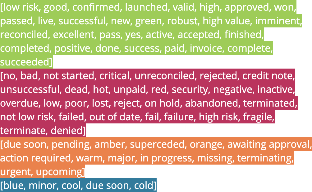
When this field is included in a view, highlight it with a colour if the content is one of a number of words. The most up-to-date values to be highlighted are shown in the administrator interface, but as of the latest update of this page, they are
Text calculations can also be coloured based on the same words - see the calculation options
Words will also automatically be coloured when a ‘radio button’ style is used for a field, i.e. when
- ‘use dropdown’ is ticked
- ‘use only given values’ is ticked
- there are three or fewer values to choose from
Swap colours
When words are coloured (see above), ‘yes’ will usually be coloured green and ’no’ red etc. However depending on the field name or question being asked, you may want to swap the colours.
For example, for a field ‘Passport Checked’, you might want yes to be green, but for a field ‘Dangerous Substances Detected’, yes should be red and no should be green. In that case, use this option to swap the colours.
The words that will have colours swapped by this option are:
- yes / no
- true / false
- low / high
Use dropdown
Rather than a simple text entry field, display a dropdown of choices from which one can be selected. If there are only a few values, then the user interface may display options in radio button style, but the behaviour is exactly the same.
Options can be provided by entering a comma separated list into the value(s) setting as below. If no options are specified, then the list of options will be automatically generated from the set of unique values already entered into records. In this way, a set of values will gradually grow as people enter new data.
See also the Use only given values option below to enforce the use of provided values only.
Use tags
Similar to Use dropdown, but rather than only letting the user select one value, multiple values can be chosen at once.
An example use may be selecting countries of origin for an ingredient, where it may come from different countries (perhaps via different suppliers).
The list of available options is specified in exactly the same way as for dropdowns above.
Use only given values
If a dropdown or tags list is used as above, ticking this option enforces the use of one of the provided values.
If it’s un-ticked, then an ‘add new entry’ option will be available for users to manually add values which aren’t yet in the list. Added values will be visible to all.
In some circumstances, it can be useful to leave this un-ticked and let options grow organically, until a certain point. Administrators can then rationalise and ‘hard-code’ values from the most commonly entered. In other situations, it may be best to specify available options right from the start.
‘Use only given values’ for relation fields
For relation fields, this option has a different use
Value(s)
For basic text fields, i.e. not those which display as dropdowns or tag lists (see below), this simply provides a default value to set the field to when a new record’s created. If not provided, the field value will be blank on creation.
Field defaults can also be calculated, with a simple or arbitratily complex calculation. To do that, instead use the Set from previous referenced field option.
Specifying dropdown lists and tags fields
If either Use dropdown or Use tags is selected, the value(s) option provides a list of options with which to populate the dropdown, or a set of tags to choose from. Enter each option here separated by commas.
If the list starts with a comma, that means the field should be blank by default when a record is created. If not, then the default will be the first value in the comma separated list.
In the dropdown/tags list, the options will be ordered alphabetically, not shown in the order they’re entered in. If you wish to give the values a particular order, you can prefix them with a number or letter followed by a closing bracket like so: 1) cold, 2) warm, 3) hot. The number prefixes won’t show to the user.
Customising the list of options per user
As well as entering a default set of options for dropdowns and tags fields as above, it’s possible to add options which will only be visible to certain users, specifically those in a certain role.
The way to add an option which will only be visible to users of a role is to add |rolename after the option, that is a vertical bar followed by the name of the role.
For example, setting the list of options to
1) not billed, 2) awaiting payment, 3) paid|finance
will mean that anyone will be able to set the field to 1) not billed or 2) awaiting payment but only members of the finance role will be able to see and set the 3) paid option (once it has been set, it will be visible to everyone).
Lists of users
Also for dropdown lists and tags fields, Agilebase can generate dropdown contents based on a list of users and/or roles in the system. To do that, select users or users and roles from the ‘fill with’ selector just below the value(s) input. The standard user ID format throughout the system is used, ‘Forename Surname (username)’.
Only users/roles which have privileges to view the data in this particular table will be shown in the list. That can keep things manageable if a system has hundreds or more users.
An example use would be assigning an account manager to a customer, selecting from a list of staff members (who are users).
When a user is selected in this way, more options for use are opened up, such as automatically emailing the selected person when there’s a status change or something is overdue for example. Agilebase can look up the user’s email address to accomplish this, See email workflows for details.
When using ‘fill with users’, the list of users to appear in the dropdown can further be narrowed down by role if required. To do that, enter the text
_users|role1,role2,role3
i.e. _users followed by a vertical bar and then a comma separated list of role names. Only users which appear in one or more of the named roles will appear.
If you want a field to auto-populate with the ID of the currently logged in user, enable both this option and the required field option.
Text case
Convert people’s input into the required case as it’s entered - choose from
- lowercase
- UPPERCASE
- Title Case
Size
If ‘short’ is chosen, a standard single line input box is displayed.
If ’large’ is chosen, a multi-line text entry box is shown. This option also lets people format the text entered, such as using bold, italics or bullet points. For data security reasons, only certain formatting is allowed.
Use as record title
The user interface has the ability to highlight the importance of certain fields by showing their contents in large font at the top of the record data. For example, a Company Name field may be the record title for an organisation record.
This option can be selected for multiple fields in a table. In that case, the first field will be the main title, others will appear as subtitles.
Preventing duplicates
Enabling the ‘use as record title’ option also has the effect of enabling duplicate detection. The system will detect when a value is entered that is close to an existing value in the system. Any ‘close’ values that are found are displayed as links to the relevant records.
This can be useful when e.g. entering company names. Although a field can be marked unique to prevent exact duplicates, that won’t pick up near matches, which this duplicate detection will. For example, ‘The Universoty Of Bristol’ and ‘University Of Bristol (UOB)’ will be detected as close matches, or ‘Agilebase’ and ‘Agilebase Ltd’.
The system uses trigram matching to detect similar values.
Feedback
Was this page helpful?
Glad to hear it! Please tell us how we can improve.
Sorry to hear that. Please tell us how we can improve.