Built In Charting
Charting is not strictly an administrator function, as any user can create charts and other data visualisations, such as maps and word clouds.
However, it’s useful for administrators to know how the system works in outline, so they can support users and also because creating charts may be a key part of building an application.
In Agilebase, charts ‘belong to’ a view. Each view can have a collection of charts. Users can toggle between viewing data rows and looking at charts based on those rows. When a user filters data using the quick filter boxes at the top of the screen, the data or charts (whichever is shown) will update to match the filtered results.
Generate a chart with AI
- In the tiles interface, open the tile and view to use as a source of chart data
- Click the charts button at the top right of the screen
- Fill in the ‘describe required chart’ field and press the add chart button
The AI can only make use of fields which are in the view, so you may wish to consider adding fields or calculations before charting
Creating a chart manually
- In the tiles interface, open the tile and view to use as a source of chart data
- Click the charts button at the top right of the screen
- Click the add/Add chart or map button
- Follow each of the steps (1 - 3) on screen to build the chart
- In the last step, give a name to the chart and press save
When choosing a type of chart in step 3, small previews will be displayed based on some of the chart data. However some chart types may display a message rather than a preview. In this case, the chart data selected in step 1 is not applicable for this chart type.
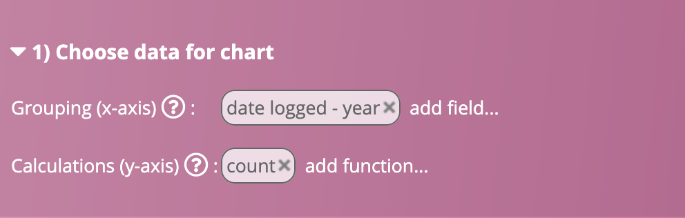
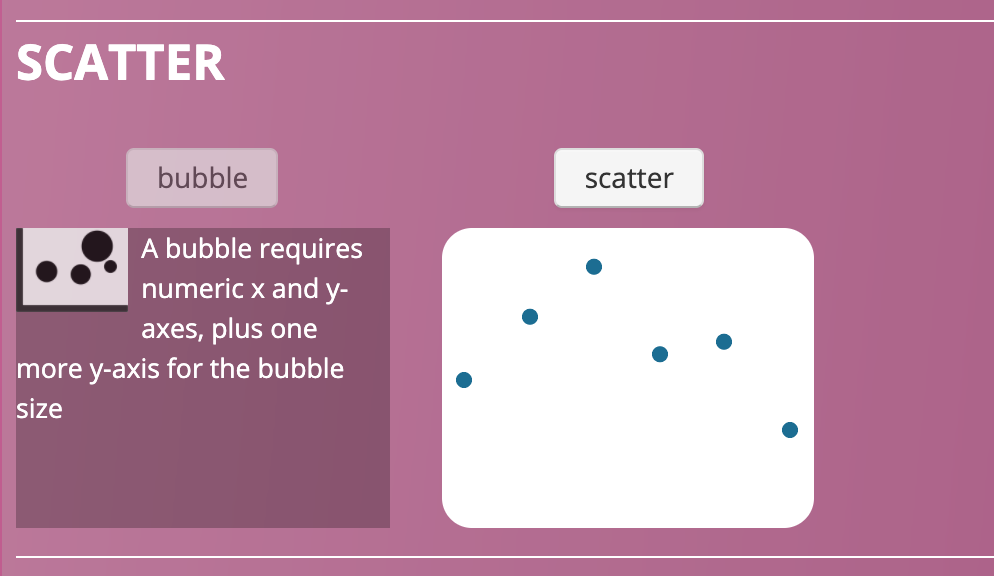
For example, if in step 1 we have a count of items per year:
then the scatter diagram will work but the bubble chart won’t. For the bubble chart, two y-axis measurements are required, one to specify the position of the bubble on the y-axis, plus another to determine the relative size of the bubble.
Editing charts
Again, this can be done either with AI or manually.
When looking at a saved chart, the burger (three lines) menu at the top right of the chart will have an ’edit chart’ option. That will bring up a space to enter a description of the change you want.
If you enter a description and press the ‘change chart’ button, AI will try to make the modification you request. If you leave the description blank however, you will instead be taken to the manual editing screen, similar to when creating a new chart manually.
Using charts
Embedding charts in forms
Charts can be embedded into tables. When the user opens a record, the chart will automatically filter to show data pertaining to that record only.
So for example if you have a chart of sales per month per customer, which you embed into a customer table, it will show as sales per month, only for the customer on screen.
This is accomplished by using a view with chart(s) as a referenced data field - see that page for setup information.
Embedding charts in tabs
When a tab contains many ‘child’ records, e.g. an organisation may have a tab which contains financial data for the past 10 years, then charts can display above the rows of data when the tab’s opened.
To accomplish this, simply add a chart to the view used by the tab. When the tab is opened, the chart will automatically be filtered to only show data pertaining to the parent table, in a similar fashion to how charts embedded using cross-referenced panels are filtered, as above.

Reporting - subscribing users or roles to charts and data
Users can be subscribed to charts (or subscribe themselves) to receive them by email.
Subscribers receive a PDF report containing all the charts and data, combined from all views they are subscribed to.
They can also opt to receive a spreadsheet export of data from a view, see below.
- In a view, click the charts button to see the charts
- Next to ‘Send these charts to me’, select a frequency, e.g. monthly.
- Under ‘Include data too’, select tabular data to include in the email too - various options will be displayed e.g. all new rows since the last email. One of those options is to send the data as a spreadsheet, the others will embed a table of data into the PDF along with the charts.
- Next to ‘roles’, select a role to send the charts and data to. All users in the role will be subscribed. Multiple roles can be added
If the view has no charts, this function can be used to send tabular data only
Feedback
Was this page helpful?
Glad to hear it! Please tell us how we can improve.
Sorry to hear that. Please tell us how we can improve.