2. Personalising our CRM by adding charts
Learning Aim: Introducing building new charts
Prerequisites: To be a competent user of agilebase, with Citizen Developer level 1 (or higher) enabled
Introduction
This short guide is going to introduce to you graphing features that becomes available to you once you’ve been given the role of Citizen Developer.
[guide 2 - video 2]
Adding a Chart
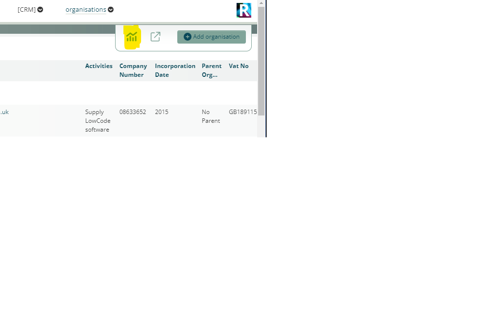
Navigate to the view containing the data for your chart
As a Citizen Developer level 1 you are able to add charts to your own views.
You don’t need to be in developer mode, simply click the graph icon top right.
Setting up the chart
Press ‘add chart or map’ and work your way through the steps.
- Add data for the x-axis
- For this example we can show the distribution in age of the Organisation records.
- We can therefore choose Incorporation Date for the X axis, specifically ‘by Year’.
- For the Y-axis we want to know how many, which is a ‘Count’ of each Organisation record.
- We can skip advanced settings and choose an appropriate Chart type. In this example ‘Packed Columns”
- Finally we can change the name of the chart, and press save.
Hopefully a picture says a thousand words as we look at the graph!
For more information about graphs in agilebase please have a look at docs charting
Feedback
Was this page helpful?
Glad to hear it! Please tell us how we can improve.
Sorry to hear that. Please tell us how we can improve.